Safety Help - Safety Check Up
A gamified experience to learn about safety Help options available on the Uber app
Overview
To facilitate great experiences on the app, safety is at the forefront of everything Uber does.
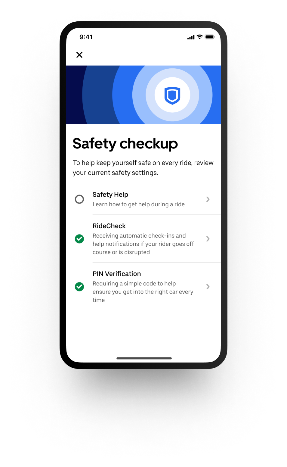
Safety check up is a gamified experience on the Uber app where Riders can educate themselves and opt in to available safety tools.
As part of my internship with the design team, I had the opportunity to design the Safety Help experience for Safety Check up which surfaces education about the emergency and non-emergency safety help options available to Riders on trips.
The problem
Riders value safety when using the Uber app. Although many safety tools already exist for Riders, they are unaware of their existence or have low familiarity with these tools. In a time sensitive situation where Riders need assistance, they need to know how to reach out for help.
The solution
Safety Help is an educational module within Safety Check Up that helps Riders get familiar with safety help options in the app. This helps prepare Riders to act if they are ever in a vulnerable situation where they need help.
Role
Apprentice Designer
Tools
Figma, pen+paper, Mural
Team
Product Design, Content Design, Product Manager, Engineer
Duration
August 2022 - December 2022
Understanding the user
Overall Riders lack awareness about the safety tools available in the app. This is supported by surveys where Riders request safety tools that already exist in the app. Riders that have an awareness of tools, such as the emergency assistance button, are reluctant to engage with the tool for fear that opening the tool will automatically call 911.
Pain Points
Performance anxiety
Riders like the emergency assistance button but are anxious about clicking it by mistake and calling 911.
Value
Some Riders question the value prop of the in app 911 emergency assistance button.
Awareness
Riders confirm they lack awareness of the Safety Toolkit, where various safety tools live.
Urgency
In an emergency situation with limited time to read through tutorials, Riders need to easily find a solution.
I also completed a competitive analysis to understand how other apps educate their users on best safety practices and features.
Armed with insights from this research, I created recommendations that helped shape how we would design Safety Check up.
Design
User Flow
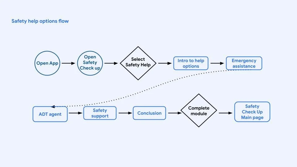
To determine the best path to take with the educational module, I developed user flows. A priority was to provide informative bite sized content but keep the module short enough to encourage completion and prevent user drop off.
This is the user flow for the first interactive experience strategy
This is the user flow for the Safety help options flow which is the strategy we aligned on.
Wireframes
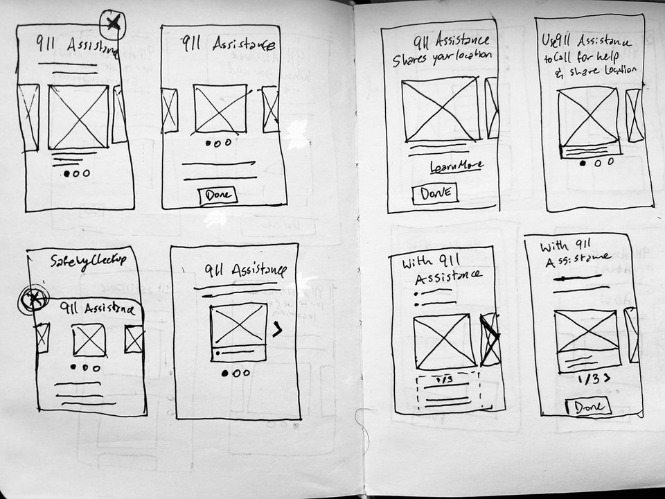
Initial wireframes and prototypes explored interactive simulations of the emergency assistance feature where Riders could test the emergency assistance button experience in a controlled space.
After meeting with the Product Manager, we expanded the scope to include all of the safety help features: emergency assistance, call or text an ADT agent, and Uber safety support. Due to time constraints and a need to create bite sized content we also pivoted from an interactive simulated experience to an educational carousel highlighting each option.
Digital wireframes for the safety help experience
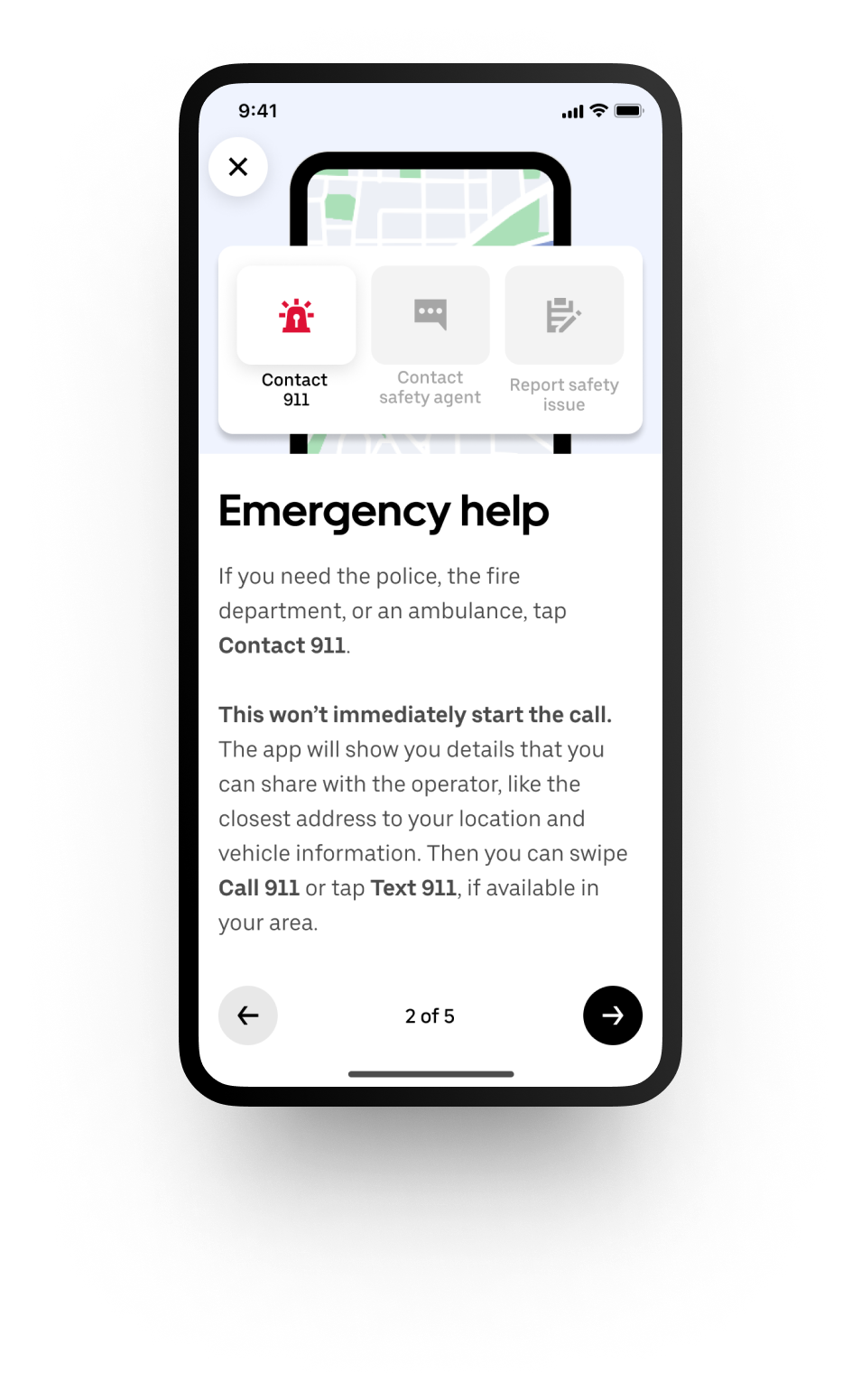
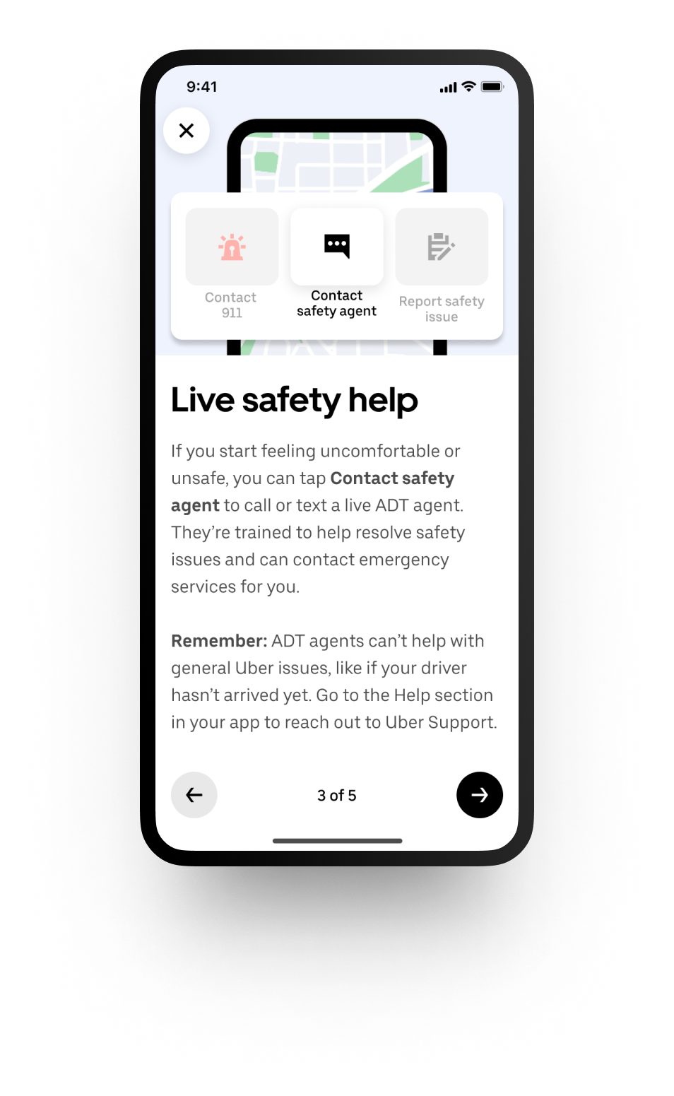
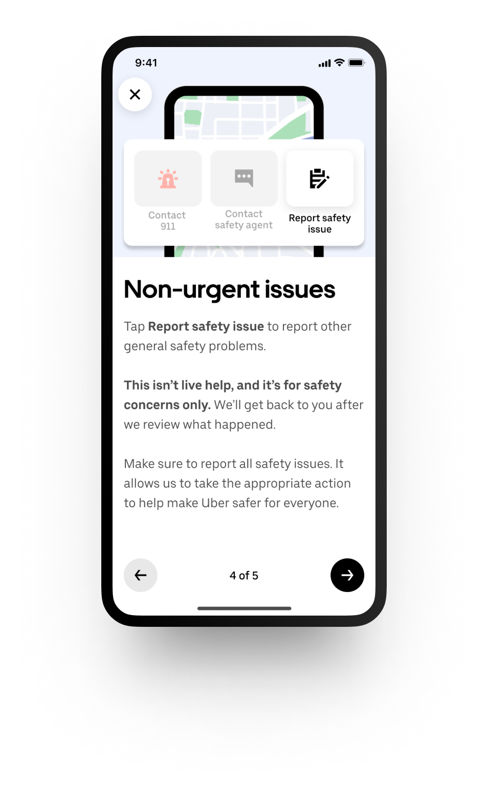
There were many explorations around how to best present the help experience to Riders in a succinct and memorable way. It was important to us to focus on the iconography and buttons of the help options to familiarize Riders with the real experience and prepare them in case they ever need to use help options. Some explorations included an abstract version with just the icons and buttons presented. Then we tried, presenting an app view with the icons and buttons as a focal point. Finally, we aligned on the final design where the presentation of the buttons is closest to the real app experience. In addition to familiarizing users with the options available, this design also helps Riders understand where all the options are in proximity to each other.
Abstract wireframe version, focuses on buttons and iconography
Less abstract wireframe version, shows the app experience with focus on buttons and iconography
Final wireframe version, shows the help options as they appear in the app to promote learning and help with spatial memory
Prototype
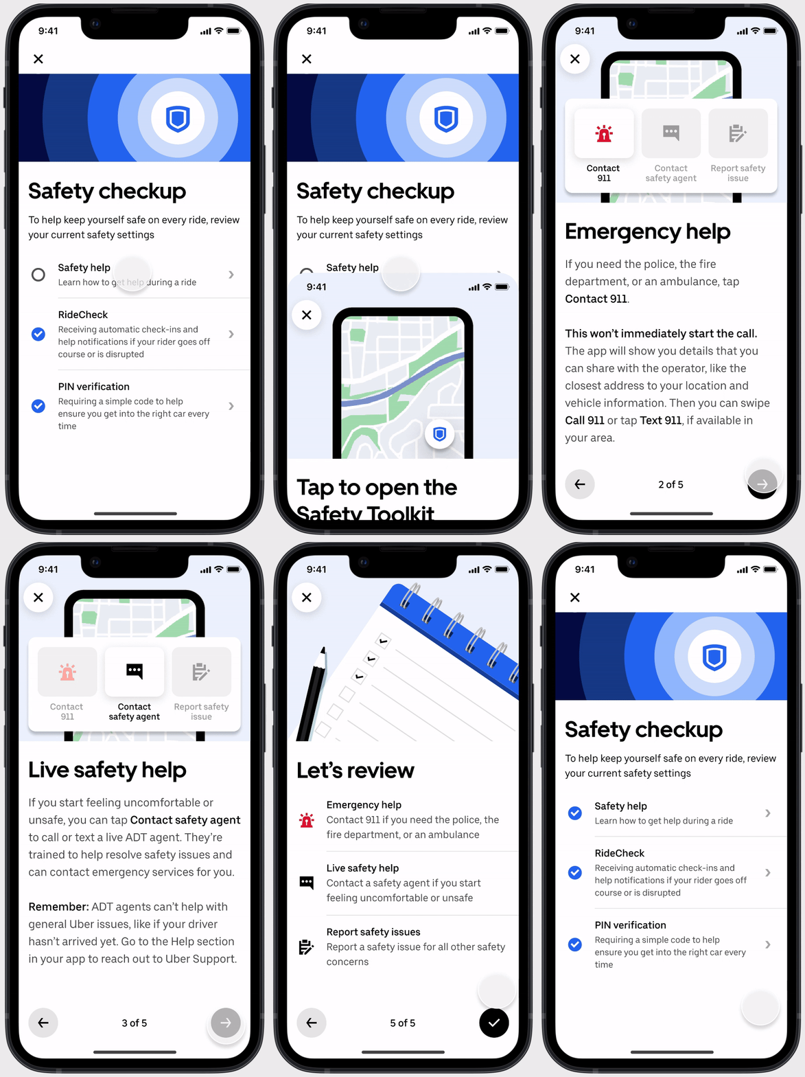
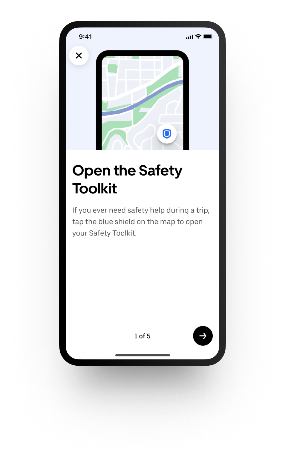
The final designs blended visuals and bite sized content to help Riders understand the use cases for each available help option and recall visually where each option is located.
The final designs included dynamic components so that the screens can easily be localized for any country. The product successfully launched ahead of our end of year code freeze deadline! Swipe the carousel to view the final prototype.
Impact
The Safety Help experience launched first as an experiment to test awareness in 6 countries including: United States, Canada, Peru, Costa Rica, Brazil, and Mexico.
In the experiment we saw significant increases in safety awareness and usage of the help features shown in the Safety Help module.
In Mexico, riders used Emergency Assistance less, which was driven by 100% decrease in usage of the tool for non-safety reasons. Interestingly in the US more Riders started using ADT for non-safety related issues which later resulted in the owner team adding a point of friction to ask riders to confirm they were reporting a safety issue to continue towards ADT.
Given the satisfactory results of the experiment, the Safety Help experience rolled out to 100% in the experiment markets and then rolled out Globally!


